In today’s fast-paced digital landscape, the importance of a professional responsive website cannot be overstated.
Whether you’re a business looking to expand your online presence, an organization seeking to engage your audience, or an individual wanting to showcase your work, a well-designed responsive website is the cornerstone of your digital journey. Explore the multifaceted advantages of professional web design from an experienced website design company, demonstrating how it can elevate your online presence and propel you toward new heights of success.
Responsive Web Design: A Comprehensive Guide
In the ever-evolving landscape of the internet, the way users access and interact with websites has undergone significant changes. As an increasing number of people use various devices such as smartphones, tablets, laptops, and desktops to browse the web, it has become imperative for websites to adapt to different screen sizes and resolutions. Responsive website design is a solution to this challenge, aiming to provide an optimal viewing experience across a wide range of devices. In this comprehensive guide, we will delve into the concept of responsive website design, its importance, principles, and best practices.
Understanding Responsive Web Design
Responsive website design refers to the approach of designing and developing websites in a way that ensures a seamless and consistent user experience across different devices and screen sizes. Instead of creating separate versions of a website for each device type, responsive web design uses flexible grids, layouts, and images to adapt the content dynamically. This adaptability is achieved through a combination of flexible grids and layouts, responsive images, and CSS media queries.
Key Components of Responsive Web Design
- Fluid Grids:
Responsive web design employs fluid grids, where layout elements are sized in relative units such as percentages rather than fixed units like pixels. This allows the layout to adjust proportionally to the screen size, providing a consistent experience across devices.
- Flexible Images:
Images are a crucial part of web content, and responsive web design ensures their adaptability. Images are set to a maximum width of 100%, preventing them from overflowing their containers and maintaining a visually pleasing layout.
- Media Queries:
CSS media queries play a pivotal role in responsive web design. They allow the website to apply different styles based on the characteristics of the device, such as screen width, height, resolution, or even orientation. This enables designers to create rules that trigger specific styles for specific devices.
Importance of Responsive Web Design
The significance of responsive web design is underscored by the evolving digital landscape and user behavior. Several factors contribute to the importance of adopting a responsive approach to web design.
1. Ubiquity of Devices
With the proliferation of smartphones, tablets, and various other internet-enabled devices, users access websites from an array of platforms. Responsive web design ensures that the website’s layout and content remain accessible and visually appealing, regardless of the device being used.
2. Enhanced User Experience
A positive user experience is a cornerstone of successful websites. Responsive web design contributes to this by eliminating the need for users to zoom in or out and scroll excessively to view content. A seamless and consistent experience enhances user satisfaction and encourages engagement.
3. Search Engine Optimization (SEO) Benefits
Search engines like Google prioritize mobile-friendly websites in their rankings. Adopting responsive design can positively impact a site’s SEO, leading to higher visibility and better search engine rankings. This is particularly relevant as mobile traffic continues to grow.
4. Cost-Effectiveness
Maintaining multiple versions of a website for different devices can be resource-intensive and costly. Responsive web design streamlines the development and maintenance process, as changes and updates can be applied universally, reducing the overall cost of website management.
5. Future-Proofing
As technology evolves, new devices with varying screen sizes and resolutions will emerge. Responsive design is a forward-looking approach that anticipates these changes, ensuring that websites remain compatible with upcoming devices without the need for major redesigns.
Principles of Responsive Web Design
Achieving effective responsive design requires adherence to a set of principles that guide the development process. These principles are fundamental to creating a website that seamlessly adapts to different devices and screen sizes.
1. Mobile-First Approach
The mobile-first approach involves designing and developing a web design for mobile devices initially and then progressively enhancing it for larger screens. This ensures that the core content and functionality are optimized for smaller screens, providing a solid foundation for the desktop version.
2. Content Priority
Prioritizing content is crucial in responsive web design. Identify the most important elements of your website and ensure they are prominently displayed on smaller screens. This may involve rearranging or reformatting content to maintain a clear hierarchy and focus on key information.
3. Breakpoints
Breakpoints are specific screen widths at which the layout of a website adjusts to accommodate different screen sizes. By strategically implementing breakpoints through media queries, designers can optimize the user experience for various devices. Common breakpoints include those for smartphones, tablets, and desktops.
4. Performance Optimization
Performance is a critical aspect of responsive design. Optimizing images, minimizing HTTP requests, and leveraging browser caching are essential practices to enhance website speed. A faster-loading site contributes to a better user experience and positively impacts SEO.
5. Testing Across Devices
Thorough testing across a variety of devices and browsers is essential to ensure that a responsive website functions as intended. Testing should cover different screen sizes, resolutions, and orientations to identify and address any issues that may arise on specific devices.
Best Practices in Responsive Web Design
Implementing responsive design effectively involves adhering to best practices that address various aspects of the development process. These practices encompass design, development, testing, and ongoing maintenance.
1. Prioritize Performance
Optimize the performance of your website by minimizing file sizes, compressing images, and utilizing techniques like lazy loading for images. A faster website not only improves the user experience but also positively influences search engine rankings.
2. Use a Mobile-First Approach
Start the design process with mobile devices in mind, ensuring that the core content, buttons and functionality are accessible on smaller screens. This approach provides a solid foundation for scaling up the design for larger screens.
3. Employ a Responsive Grid System
Utilize a responsive grid system to create a flexible and fluid layout. This grid system enables the content to adapt to different screen sizes, maintaining a consistent structure and readability across devices.
4. Optimize Images for Responsiveness
Resize and compress images to ensure they are optimized for various screen sizes. Use the max-width: 100% CSS property to prevent images from exceeding the width of their containers, promoting a visually pleasing and responsive web design.
5. Test Rigorously
Test your responsive design thoroughly across multiple devices, browsers, and screen sizes. Consider using testing tools and emulators to simulate different environments and identify potential issues before deploying the website.
6. Keep Navigation Intuitive
Navigation is a critical aspect of user experience. Ensure that navigation menus are intuitive and easy to use on both small and large screens. Consider using mobile-friendly navigation patterns, such as hamburger menus, for a streamlined experience on smaller screens.
7. Embrace Flexbox and CSS Grid
CSS Flexbox and Grid layout systems provide powerful tools for creating flexible and responsive designs. Embrace these layout techniques to simplify the creation of complex and adaptive layouts without relying heavily on media queries.
8. Maintain Consistent Branding
Consistency in branding elements, such as colors, fonts, and imagery, contributes to a cohesive user experience. Ensure that your brand identity remains consistent across different devices, reinforcing familiarity and trust among users.
Responsive website design is not just a trend; it’s a fundamental approach to web development that addresses the diverse ways users access content in today’s digital landscape. By adopting responsive design principles and best practices, web designers and developers can create websites that deliver a seamless and consistent user experience across a myriad of devices. As technology continues to advance, the importance of responsive design will only grow.
First Impressions Matter
They say you never get a second chance to make a first impression, and this adage holds true in the digital world. A professional website design has the power to create an immediate and lasting impression on visitors. Within mere seconds of landing on your site, users form opinions about your brand’s credibility and professionalism. A visually appealing and well-structured website instills trust and encourages users to explore further, setting the stage for meaningful interactions.
Testing and Prototyping are at the Core of Web Design
A successful website doesn’t happen by accident. It happens through intelligent information architecture, navigation, wireframing, a comprehensive design process, laser focused ui patterns and user research, mobile friendliness, performance optimization and the utilization of adaptive web design scenarios.
Tailored User Experience Based on Web Design Trends
Professional website design places ux design user experience at its core. Every element, from navigation to layout and content flow, is a meticulously crafted ui design to ensure a seamless and engaging interaction. By prioritizing the needs and preferences of your target audience, user-centric design minimizes bounce rates and fosters a positive perception of your brand.
Enhanced Brand Identity
Your website serves as an extension of your brand identity. A professional design ensures consistency in branding elements such as color schemes, typography, and logo placement. This consistency enhances brand recognition and fosters a cohesive brand image across all digital touchpoints, reinforcing your brand’s identity in the minds of your audience.
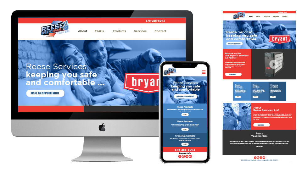
Mobile Responsiveness
In an era where mobile devices drive a substantial portion of web traffic, a professional website design is inherently responsive. It seamlessly adapts to different screen sizes, providing users with an optimal experience regardless of the device they are using. This adaptability is essential for reaching and engaging a diverse audience.
Search Engine Visibility
Professional web design and search engine optimization (SEO) go hand-in-hand. Search engines favor well-structured, fast-loading websites with clean code, and minified css and javascript. A properly optimized site has a better chance of ranking higher in search engine results, driving organic traffic to your content and expanding your digital reach.
Faster Loading Times
Speed is a critical factor in the digital realm. A professionally designed website is optimized for faster loading times, user flow, lazy loading, and image optimization minimizing user frustration and abandonment. Improved site speed contributes to a positive user experience and positively impacts your search engine rankings, making it a win-win for both your audience and your visibility.
Seamless Navigation
Clear and intuitive navigation is paramount for guiding users through your website. A professional design incorporates well-organized menus, breadcrumbs, and navigation elements that ensure visitors can find the information they’re seeking with ease. This streamlined navigation enhances the overall user experience.
Trust and Credibility
A well-designed website conveys trust and professionalism. Users are more likely to trust a business or organization that invests in a polished online presence. Trust, in turn, translates into increased conversions, whether in the form of sales, subscriptions, or inquiries. Building trust is a cornerstone of successful digital interactions.
Effective Call-to-Actions (CTAs)
Professional web design strategically places CTAs, buttons, and forms to guide users toward desired actions. Whether it’s encouraging users to make a purchase, sign up for a newsletter, or contact your team, CTAs are optimized for visibility and engagement. Thoughtful placement of CTAs can significantly impact your conversion rates and overall website effectiveness.
Analytics and Insights
Modern website design integrates analytics tools that provide valuable insights into user behavior. By tracking metrics such as page views, click-through rates, and conversion rates, you gain a deeper understanding of your audience’s preferences and behaviors. Armed with this data, you can refine your website strategy to maximize results and continually improve the user experience.
Scalability and Flexibility
A professional web design is built with scalability in mind. As your business or goals grow, your website can be expanded and modified to accommodate new features, content, and functionalities. This scalability ensures that your website can evolve with your needs, saving you the hassle of frequent overhauls.
Competitive Edge
In a crowded digital landscape, a professional web design provides you with a significant competitive edge. An aesthetically pleasing and user-friendly site sets you apart from competitors with outdated or poorly designed websites. It communicates your commitment to excellence and distinguishes you as a leader in your field.
Accessibility and Inclusivity
Professional web design takes accessibility into consideration. It ensures that people with disabilities can access and navigate your content. This commitment to inclusivity not only aligns with ethical standards but also meets legal requirements, ensuring that your website serves as an accessible platform for all users.
Integration of Advanced Features
From e-commerce capabilities that facilitate online transactions to interactive elements that captivate and engage visitors, a professional website design can incorporate advanced features that enhance the user experience and provide unique value to your audience. These features can set you apart from competitors and deliver a more compelling online presence.
Efficient Content Management
Modern web design often integrates user-friendly content management systems (CMS). These systems empower you to easily update and manage your website’s content without requiring advanced technical expertise. This efficiency ensures that your website remains current and relevant to your audience.
The benefits of professional web design are extensive and profound. A well-crafted website design is more than just a digital storefront; it is a strategic asset that drives business growth, enhances brand perception, and fosters meaningful connections with your target audience. In an ever-evolving digital landscape that offers video, images, animation and design patterns that deliver visitors to your organization. Investing in professional website design is not merely an option—it is a necessity for businesses and individuals seeking to thrive and make a lasting impact in the modern age. Your website is your digital gateway, and by harnessing the power of professional web design systems, smart navigation, professional typography and more, you can unlock its full potential and pave the way for a successful online journey.